
下載億題庫(kù)APP
聯(lián)系電話:400-660-1360
下載億題庫(kù)APP
聯(lián)系電話:400-660-1360

請(qǐng)謹(jǐn)慎保管和記憶你的密碼,以免泄露和丟失
請(qǐng)謹(jǐn)慎保管和記憶你的密碼,以免泄露和丟失
The Graphic Presentation of Data
A histogram is a bar chart of data that have been grouped into a frequency distribution.
微信截圖_1596772478156420200807115727597.png)
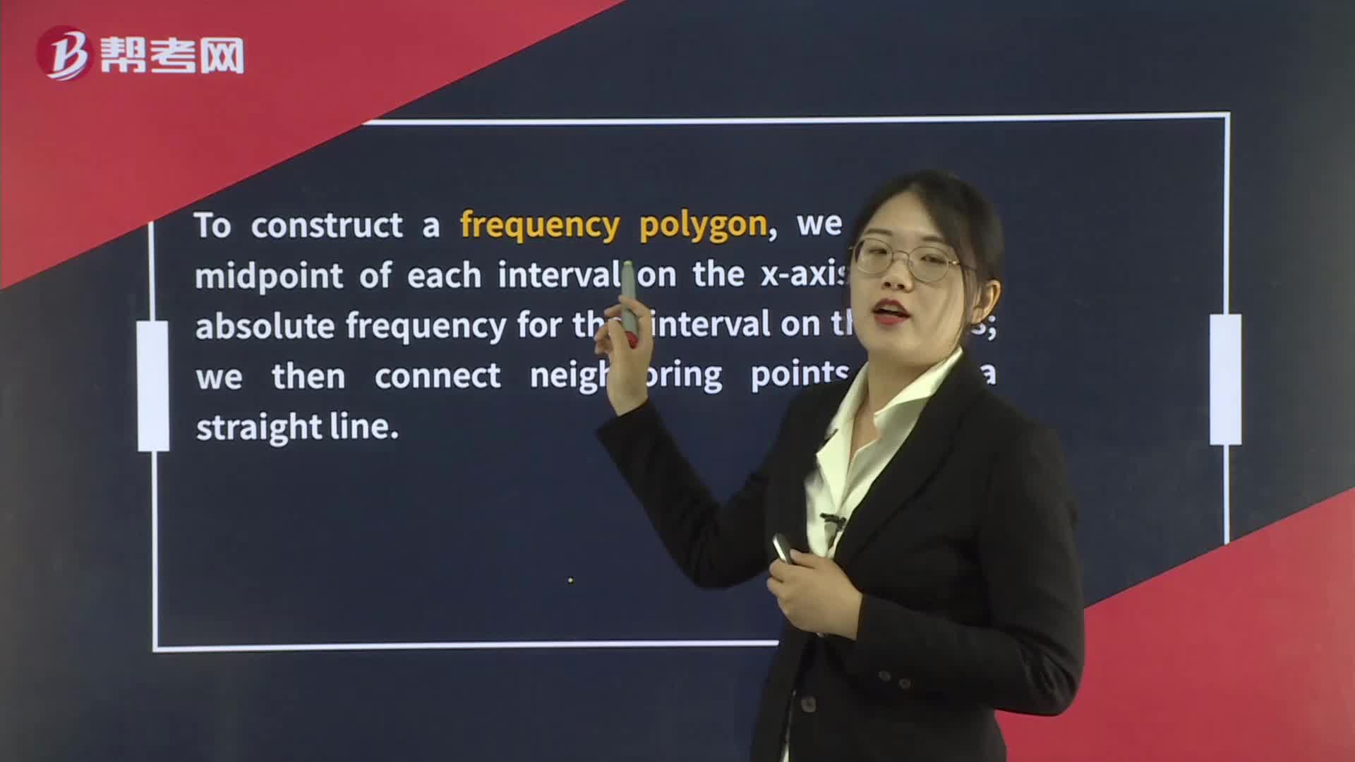
To construct a frequency polygon, we plot the midpoint of each interval on the x-axis and the absolute frequency for that interval on the y-axis; we then connect neighboring points with a straight line.
微信截圖_1596772543692920200807115749366.png)
Cumulative frequency distribution can plot either the cumulative absolute or cumulative relative frequency against the upper interval limit. The cumulative frequency distribution allows us to see how many or what percent of the observations lie below a certain value.
微信截圖_1596772582144820200807115808776.png)
 123
123The Graphic Presentation of Data:x-axis and the absolute frequency for that interval on the y-axisthe observations lie below a certain value.
 89
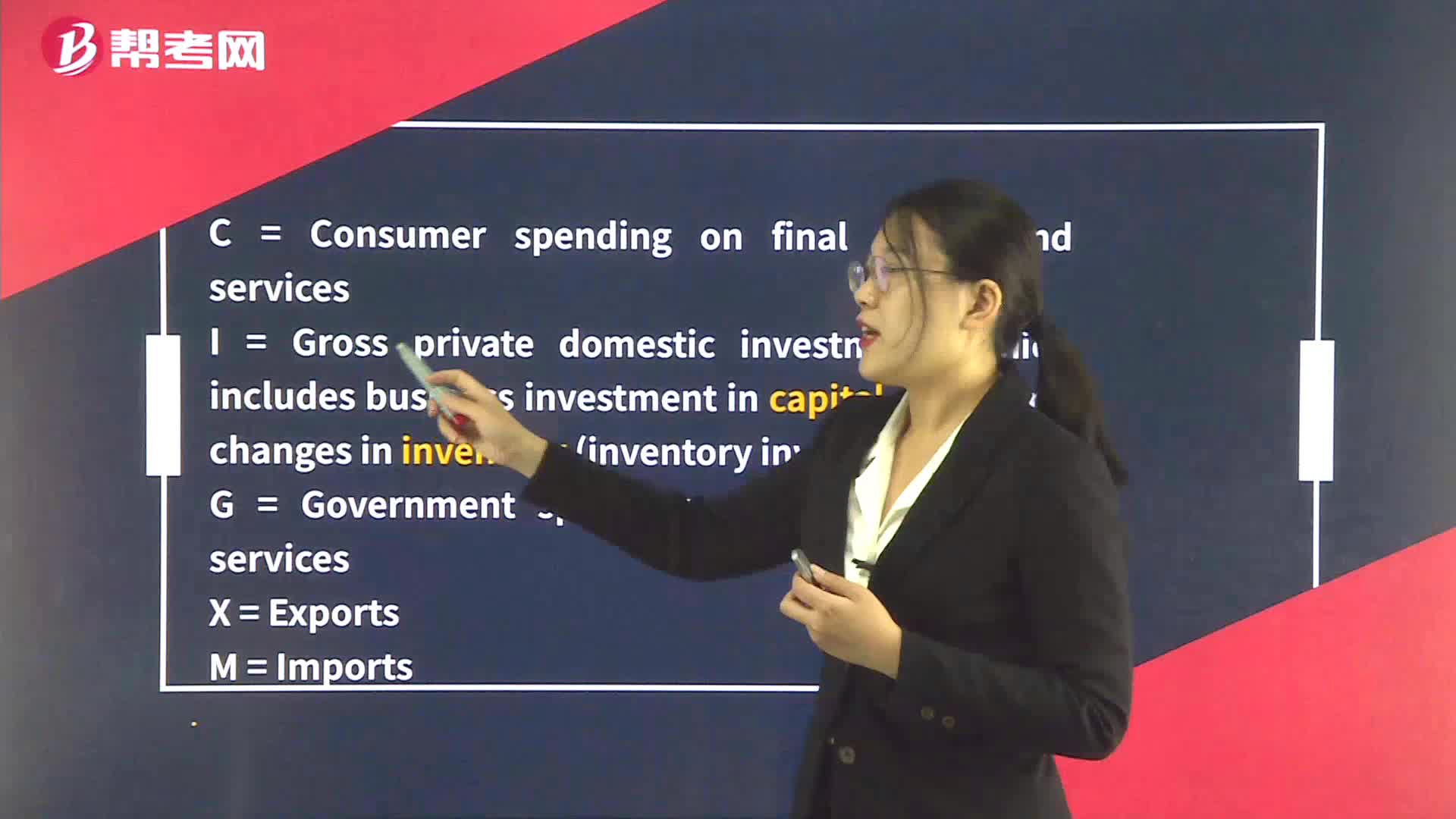
89The Components of GDP:The Components of GDP:servicesM = Imports
 196
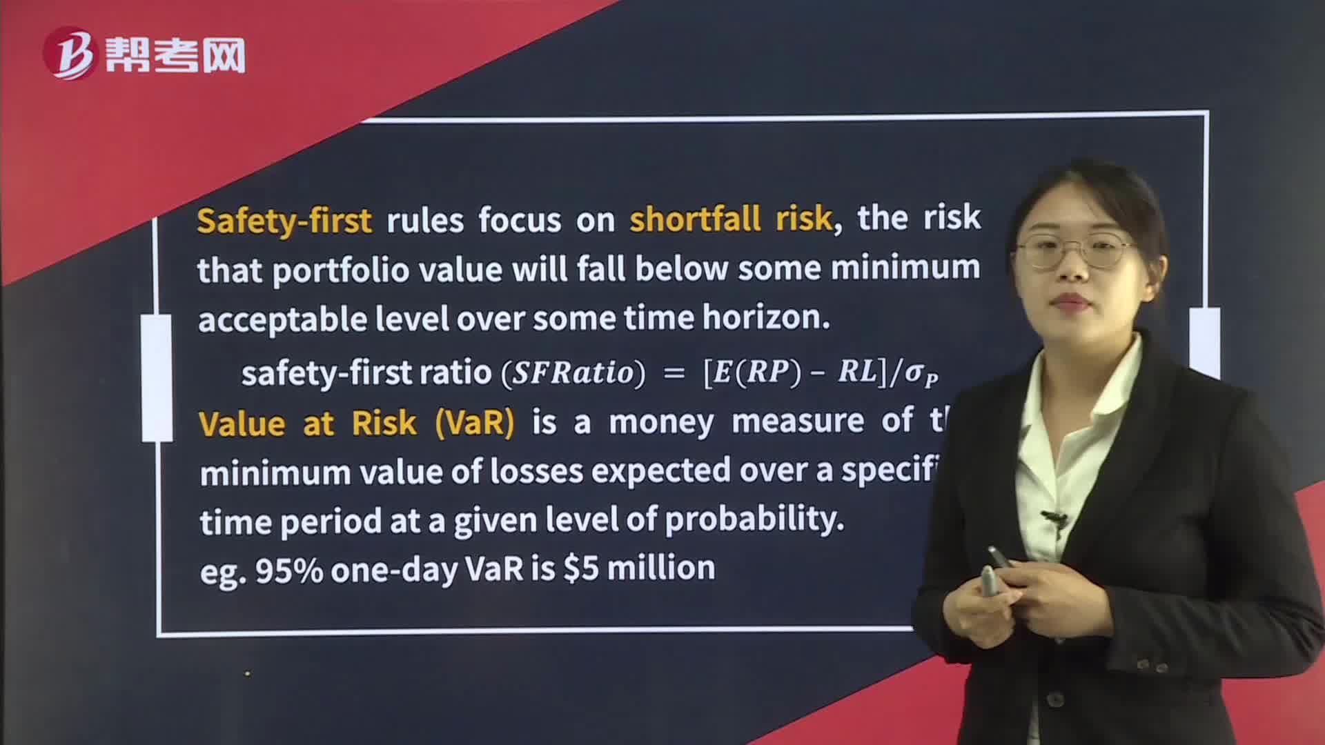
196Applications of the Normal Distribution:horizon.,safety-first ratioSFRatio=[ERP–RL]σP?[Practice:ABCAllocation C = 8.5 – 4.5 14.34 = 0.279

微信掃碼關(guān)注公眾號(hào)
獲取更多考試熱門資料