
CFA考試相關(guān)視頻
The Graphic Presentation of Data
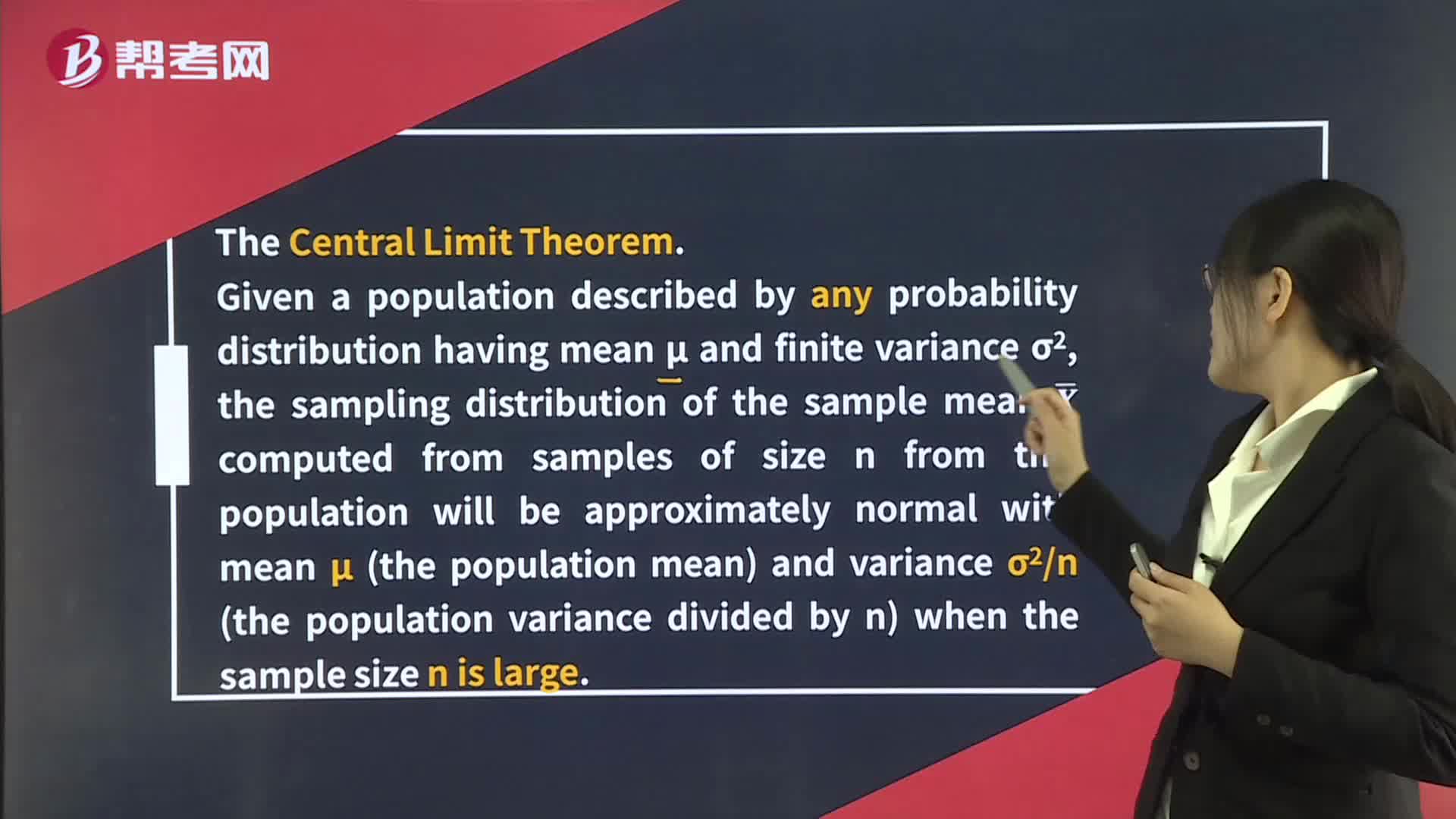
Distribution of the Sample Mean
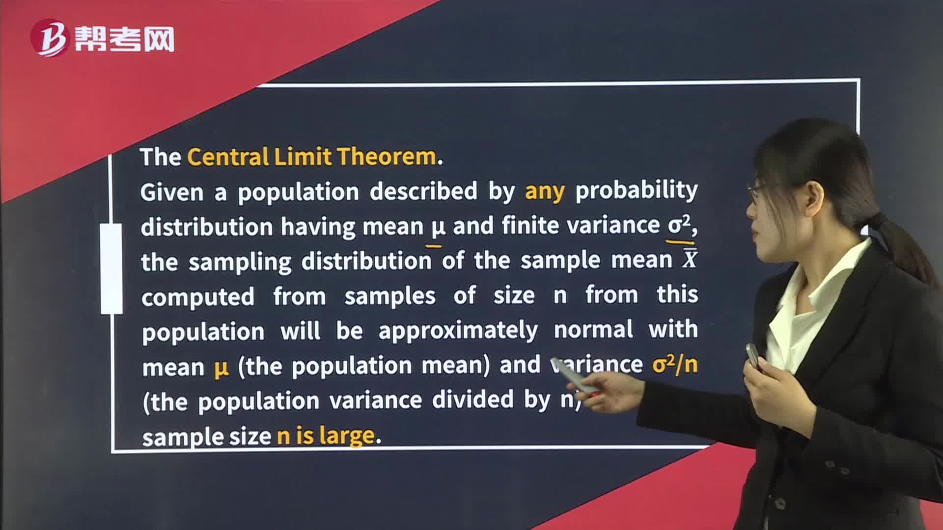
Distribution of the Sample Mean
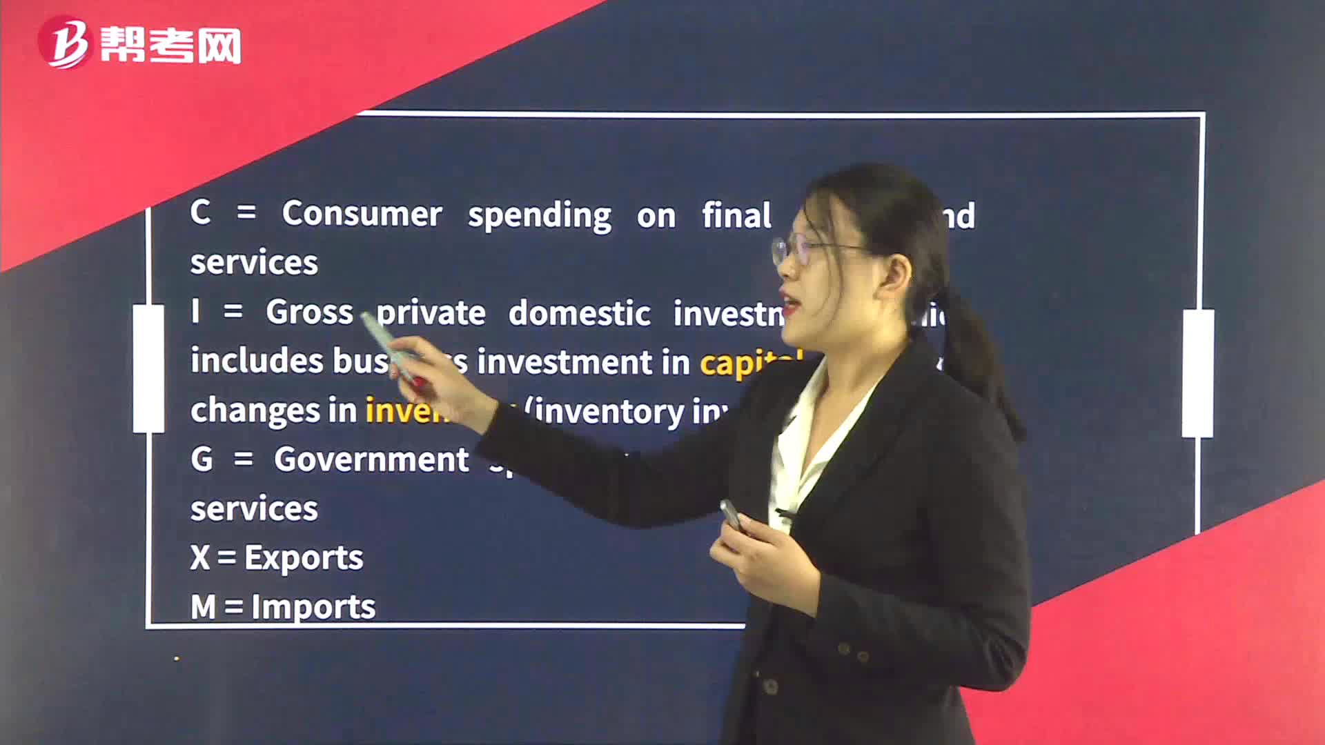
The Components of GDP
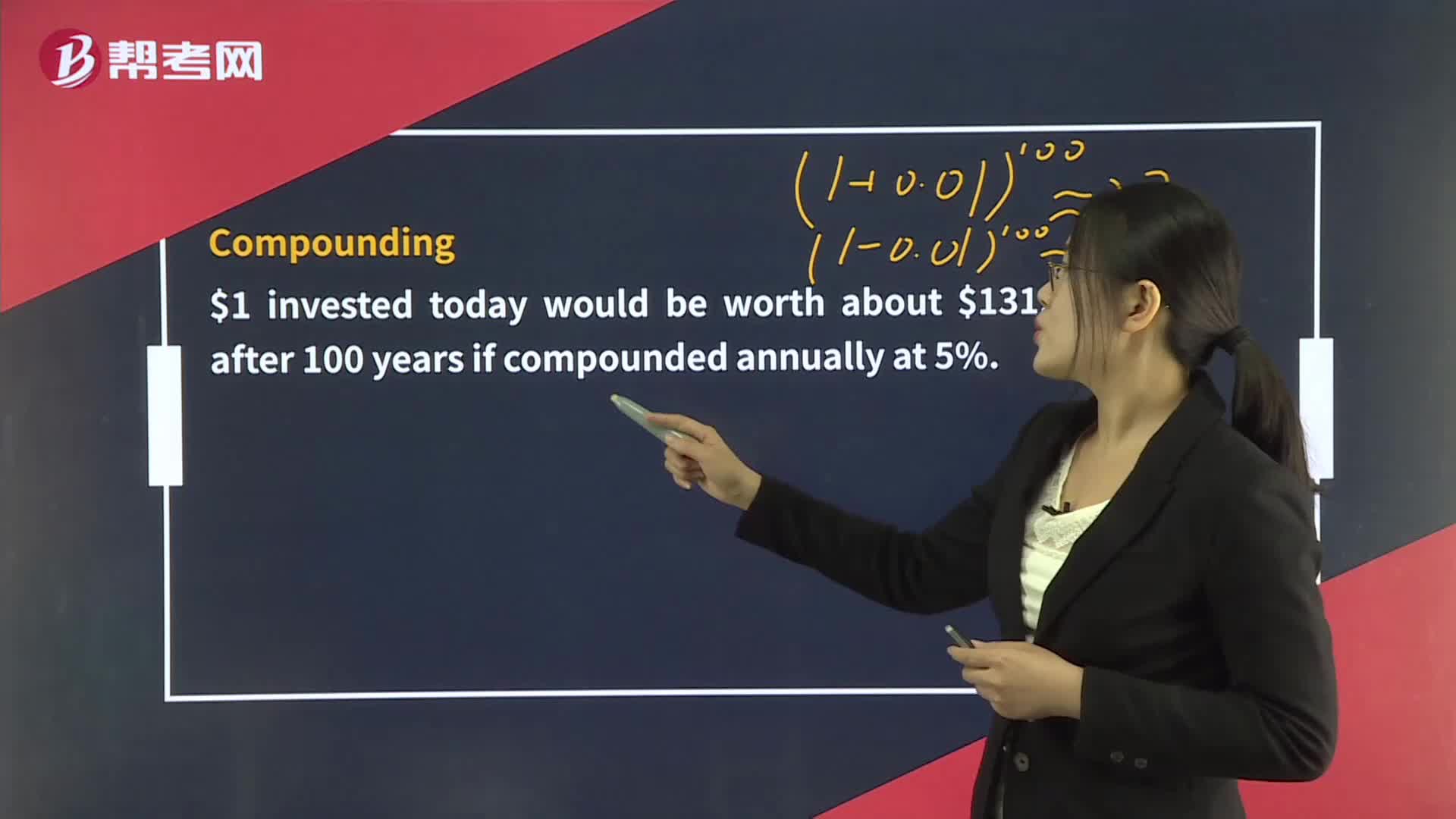
The Time Value of Money
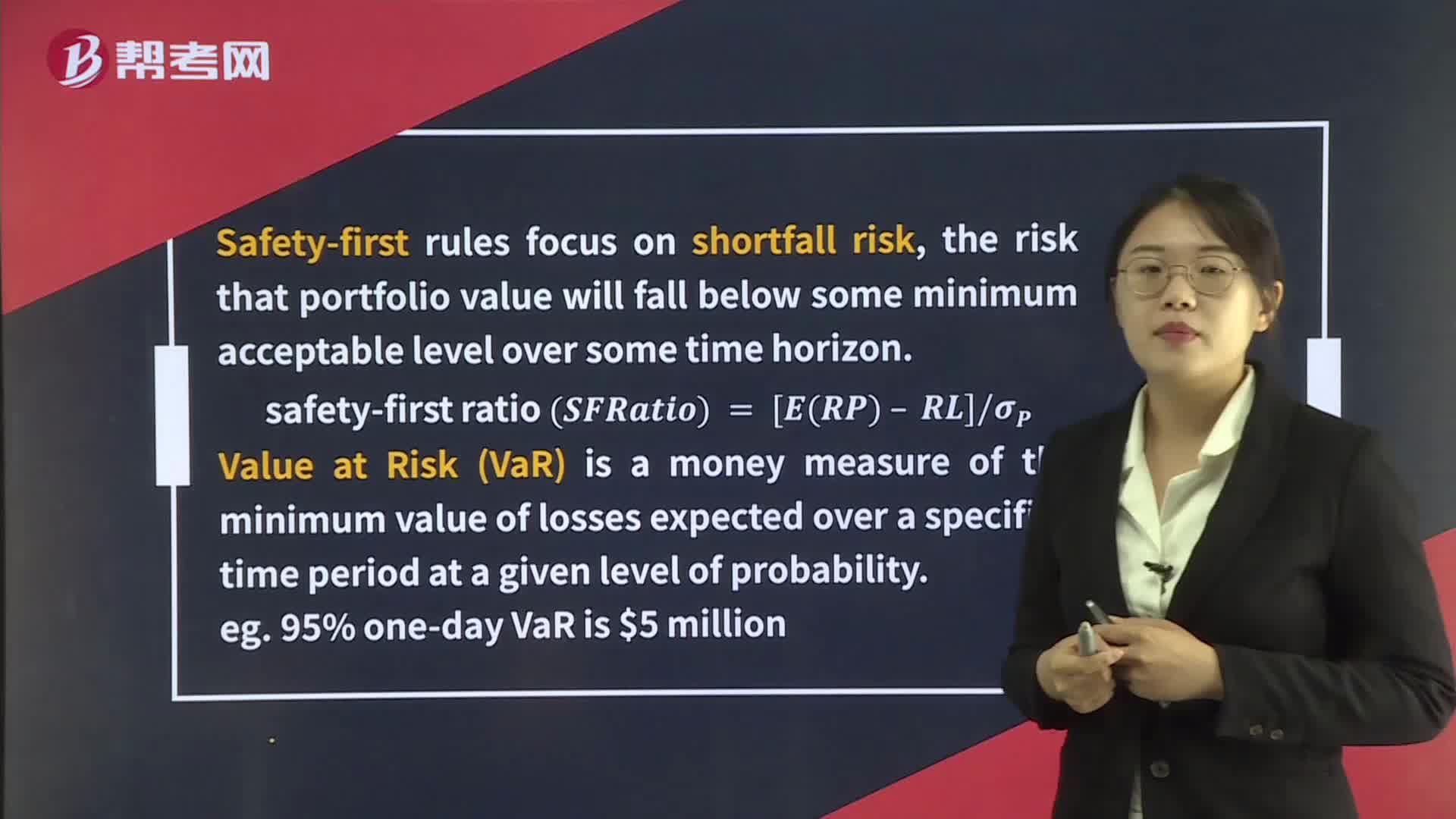
Applications of the Normal Distribution
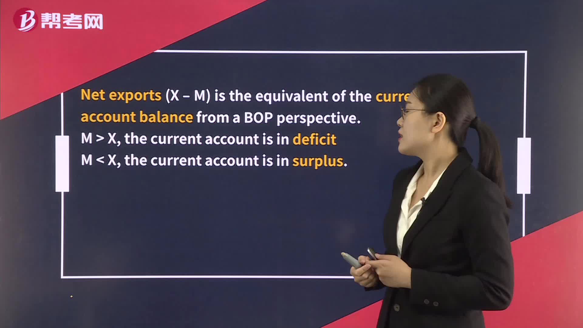
National Economic Accounts and the Balance of Payments
The Roles of Central Banks
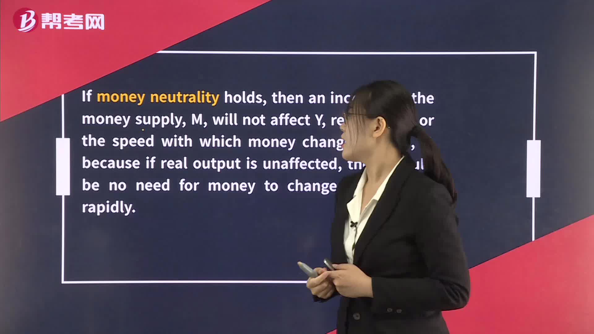
The Quantity Theory of Money

The Roles of Central Banks
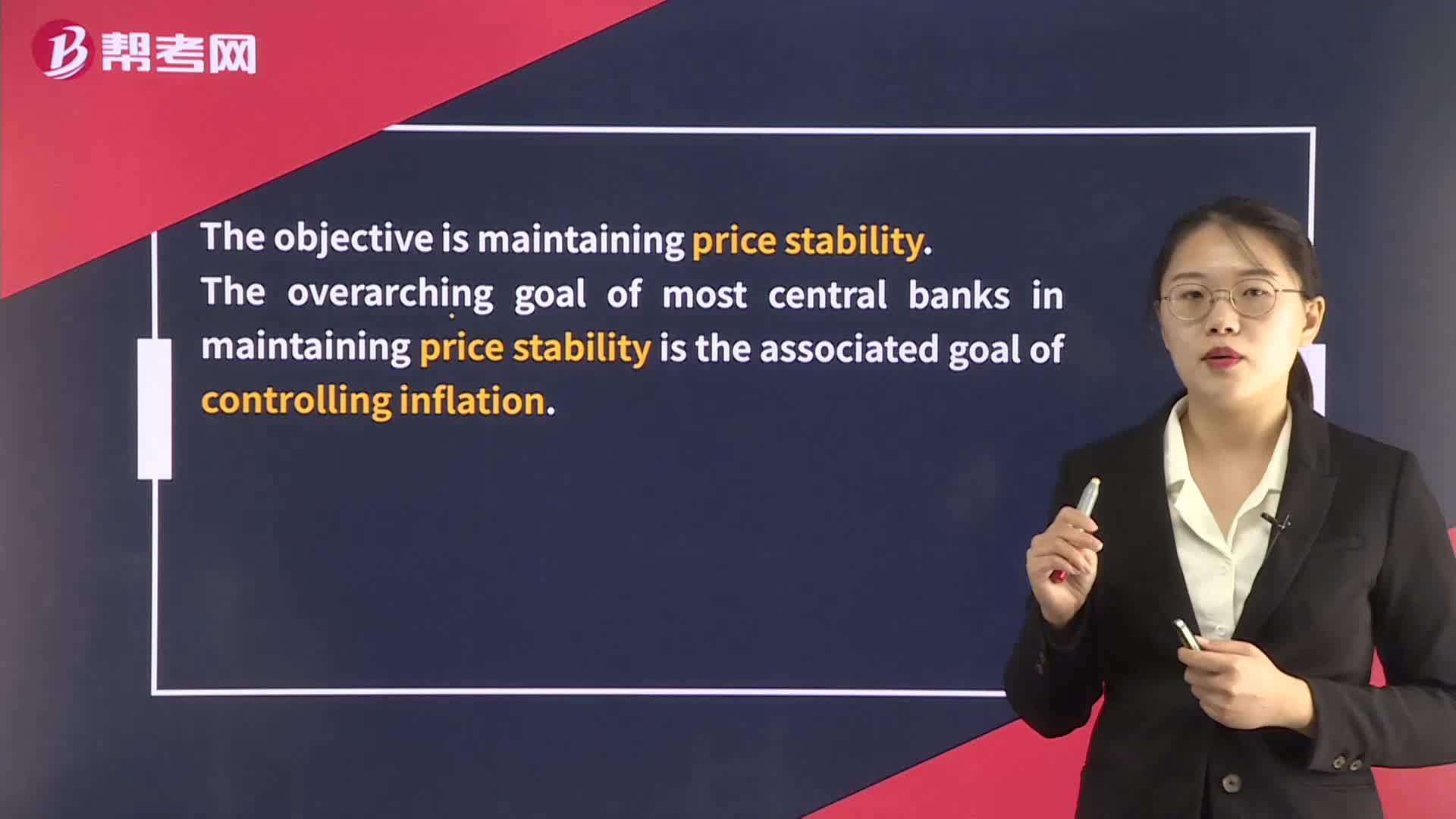
The Objectives of Monetary Policy
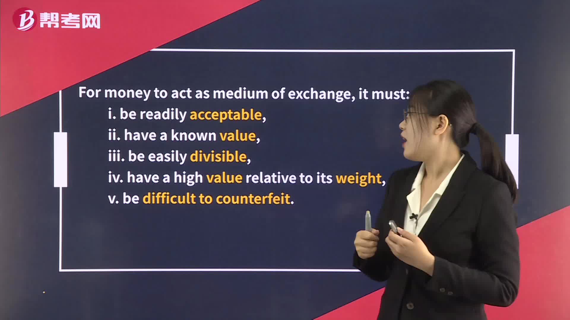
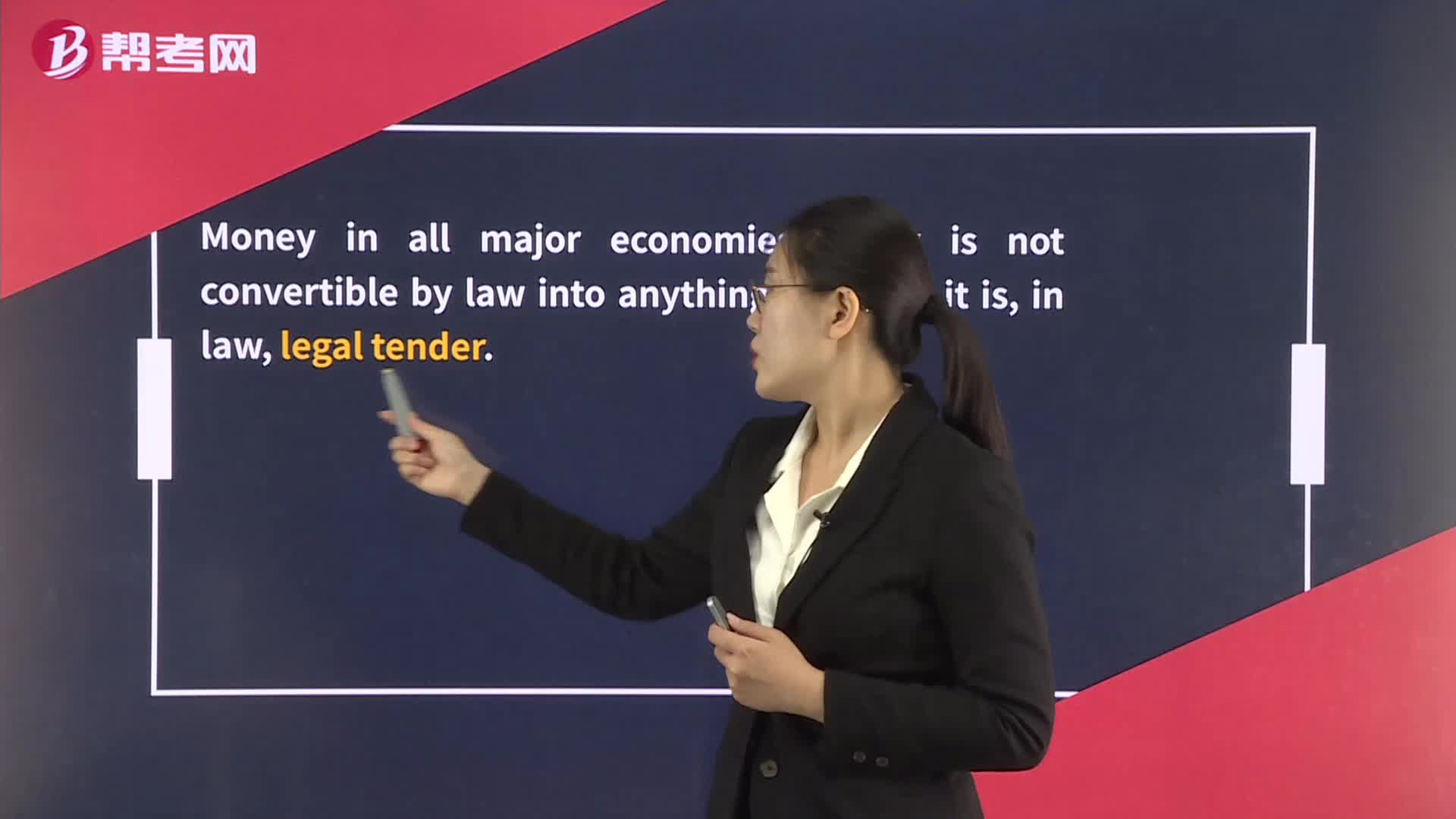
The Functions of Money